What is data visualization?
A visualization is a visual representation of data, such as a grid, line chart, or heat map. Visualizations provide different ways to view and interact with data within a dashboard, allowing you to explore relationships between data elements, create visually compelling charts that summarize key business indicators, combine data from multiple datasets into a single visualization, and include multiple visualizations within a single dashboard panel or chapter.
Types of data visualizations
A wide array of data visualizations exists, each suited to identify patterns and serve different purposes. Some common types include:
- charts (bar, pie, line, scatter and area)
- graphs (network, tree maps, heat maps)
- maps (geographic, choropleth)
- dashboards (interactive dashboards)
- other (grids, box plots, waterfall charts, histograms, time series)
What is your purpose?
Before you dive into your data, it’s important to define the purpose and nature of your visualization. Answering two questions will help you determine the best approach:
Is the information conceptual or data-driven? Are your data abstract concepts or measurable quantities?
Is your goal to explain or explore? Are you communicating known information or trying to uncover new insights?
These questions show four types of visual communication:
- Illustrate concepts: Transform complex ideas into clear visuals using diagrams, charts, or metaphors.
- Spark ideas: Unleash creativity and explore new concepts by sketching, doodling, and diagramming during brainstorming sessions.
- Uncover insights: Reveal hidden patterns and relationships in your data through visual exploration. This process can include both targeted and exploratory analysis.
- Communicate clearly: Effectively convey a single message in presentations with simple and powerful charts and graphs.
Benefits and challenges of data visualization
Data visualization tools translate complex data science processes into actionable insights. But they also present unique challenges that organizations must overcome to effectively realize their full potential.
Benefits:
- Improved decision-making: Visualizations give you the clarity you need to make faster, data-driven decisions.
- Enhanced communication and collaboration: Easily share insights across teams and foster a data-driven culture within your organization.
- Increased efficiency and productivity: Quickly identify trends and patterns, so you can streamline processes and optimize operations.
Challenges:
- Choose the right visualization: Selecting the most appropriate chart or graph for your data can be tricky. Careful consideration of your goals and data types is essential.
- Avoid misleading visualizations: It’s important to ensure that visualizations accurately represent the data without distortion or bias.
- Data accuracy and integrity: The effectiveness of your data visualization depends on the quality and reliability of your underlying data. Clean data is mandatory.
The role of data visualization in business
Data visualization is a game-changer across various business functions, such as:
- Strategic decision-making: Executives use visualizations to assess market trends, evaluate risks, and spot new opportunities.
- Operational efficiency: Identify process bottlenecks, track performance metrics, and monitor resource utilization with visual insights.
- Customer insights: Analyze customer data through visualizations to gain a deeper understanding of preferences, behaviors, and needs.
Strategy: empowering data-driven decisions
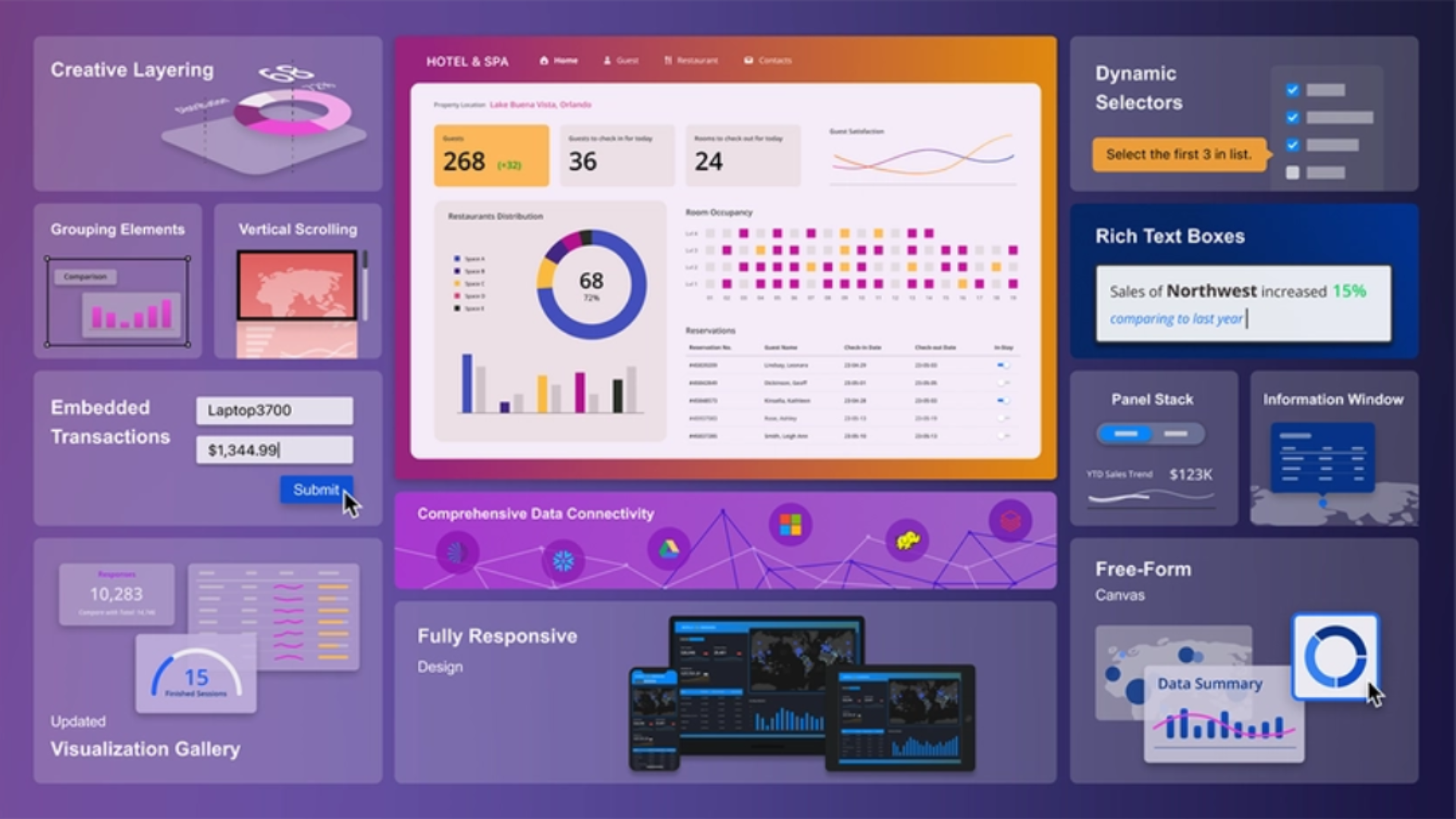
As businesses grow, so does the volume of data they need to manage. This is where advanced BI tools become crucial. Conventional tools often necessitate sampling or summarization, potentially losing valuable insights. The Strategy ONE platform provides extensive data visualization capabilities:
- Vast library of visualizations: Use pre-built visualizations or design your own.
- Interactive dashboards: Create dynamic dashboards that allow users to explore data on their own.
- AI-powered insights: Leverage the AI capabilities of MicroStrategy to uncover hidden patterns and gain a competitive edge.
- Embedded analytics: Integrate visualizations directly into your existing applications and workflows.
Data visualization helps you make sense of complexity, spot patterns, and make faster decisions – whether you’re thinking about strategy, customer experience, or operational efficiency.
Your data is already there-the question is how to make it visible. A well-crafted visualization isn’t just beautiful; it’s a strategic tool that can support decision-making, enhance collaboration, and reveal relationships that might otherwise remain hidden in raw numbers.
(source: https://www.strategysoftware.com/blog/data-visualization-your-compass-in-the-business-landscape)